Seamless Shopping, United Experience
In a world where families strive to balance their busy lives, groceries, and quality time, a single idea emerged
Blinkit Together
Timeline
8 weeks, Independent project.
My role
Ideation, Experience Strategy, Research, Visual Design, Interaction Design.

Multiple companies implementing this features




Identity
Gilroy UI variable Text
Aa123


Project Background
It all started with...

The motivation was simple. I wanted to turn the mundane task of grocery shopping into a social and efficient experience. And that's how the idea for the “Blinkit Shared Shopping” feature was born.
a typical day, with my mobile phone in hand, I swiped through numerous apps, from meal planning to budget tracking, trying to piece together a more efficient shopping process. That's when it hit me. What if there was a single platform that could streamline this entire experience?
provide users with a simple yet powerful tool to create shared shopping lists and to connect friends and family seamlessly within the app.
No more lost notes or endless text messages back and forth;
everything you need is in one place.
Our goal was to

Learn more
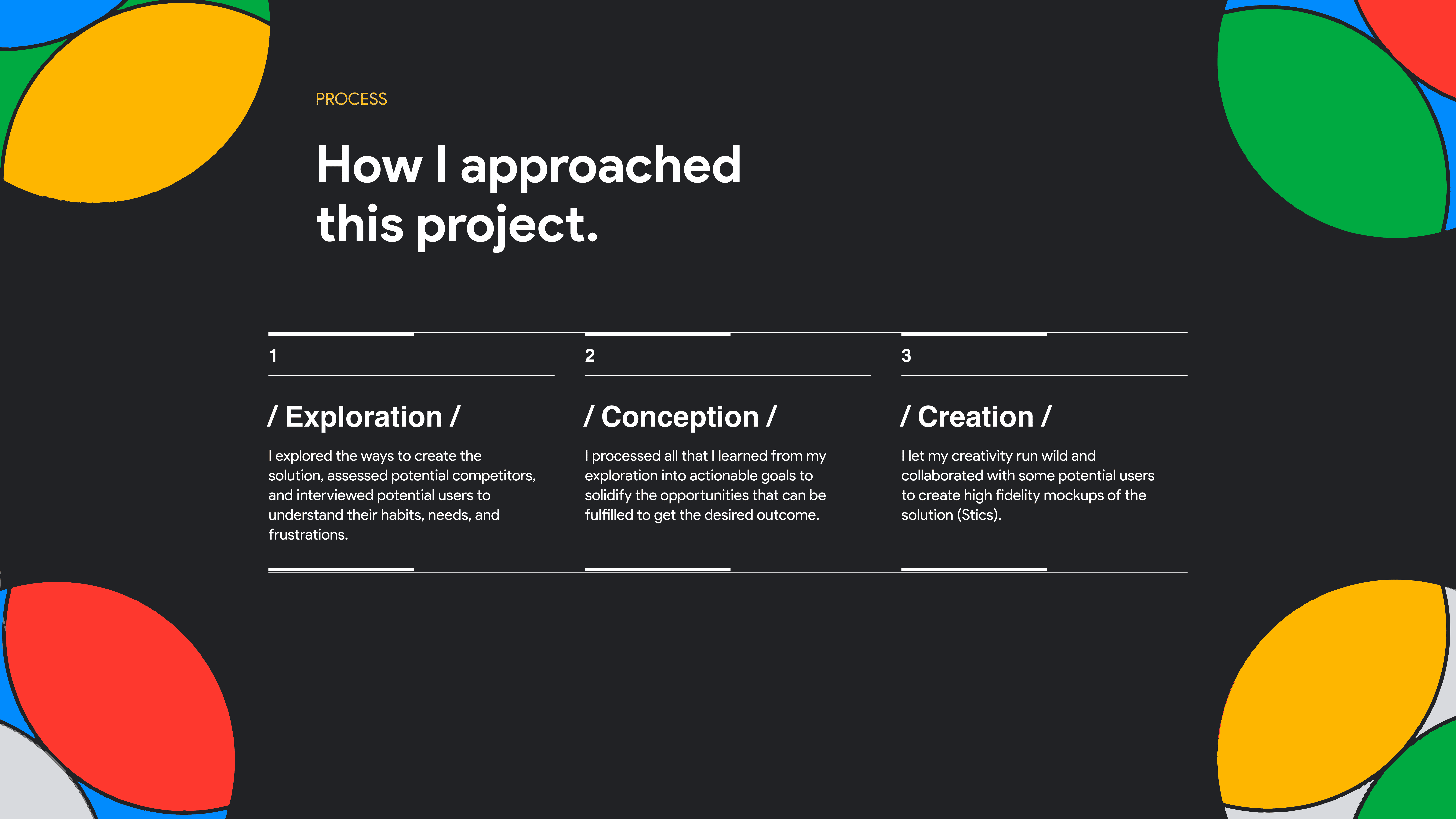
1
/ Exploration /
I explored the ways to create the
solution, assessed potential competitors,
and interviewed potential users to
understand their habits, needs, and
frustrations.
2
/ Conception /
I processed all that I learned from my
exploration into actionable goals to
solidify the opportunities that can be
fulfilled to get the desired outcome.
3
/ Creation /
I let my creativity run wild and
collaborated with some potential users
to create high fidelity mockups of the
solution (Stics).
Process
How I approached
this project.
Exploration
Is creating “Blinkit Together” even worth it?
This is the main thing that I wanted to find out at this phase. And if it is, then what aspects should I focus on to make it most effective.
I started by…
Data set
Figuring out what
to include in “Blinkit Together”
So that, I can use that to give more context to the participants while pitching them the idea.
UI structure
Creating a sketch of the
barebone UI for “Blinkit Together”
So that, I can use that to give the participants more
context, and use it myself while analyzing the competitors.
And then the
exploration began...

Here’s what I found.
About the
competition
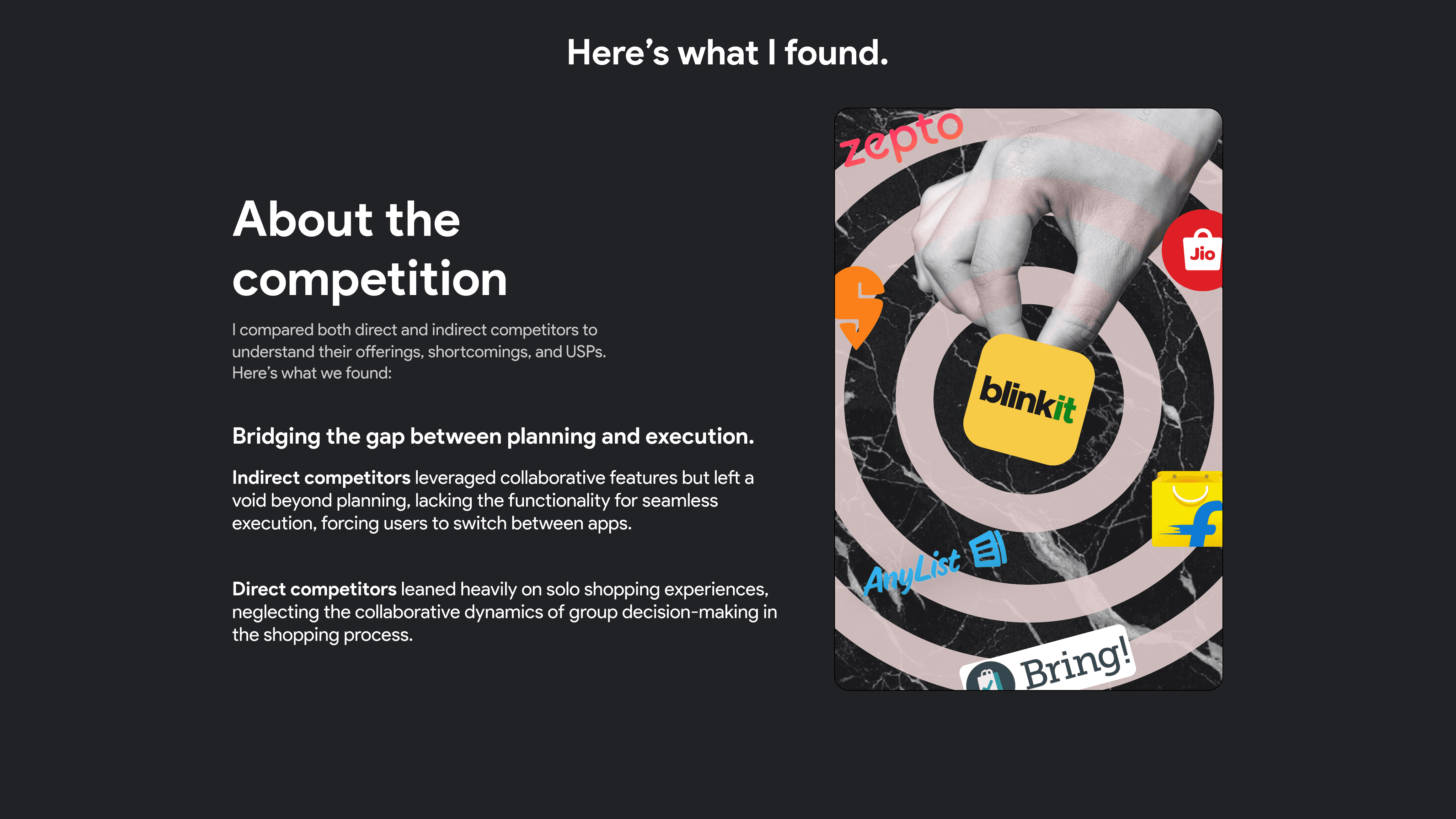
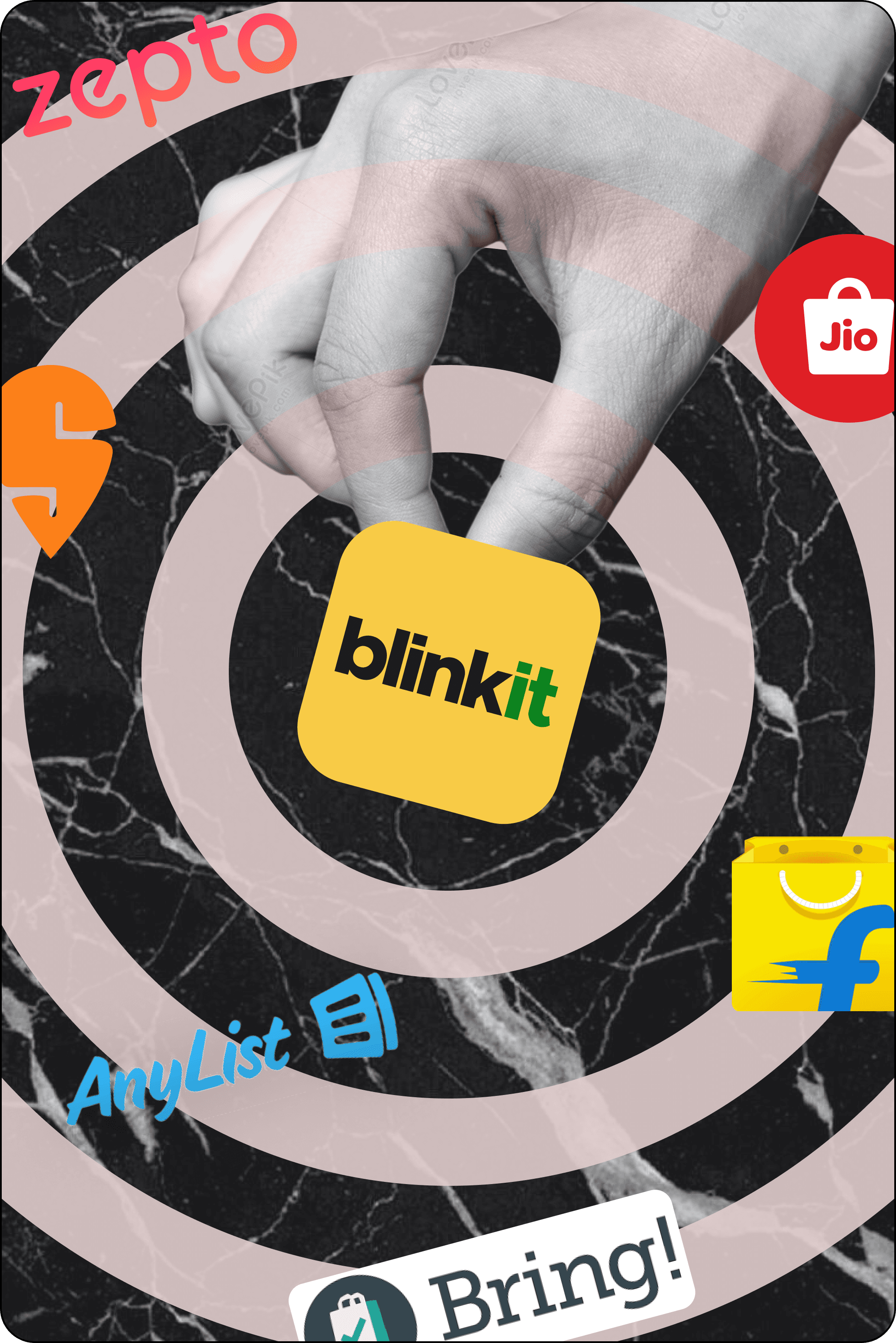
I compared both direct and indirect competitors to
understand their offerings, shortcomings, and USPs.
Here’s what we found:
Indirect competitors leveraged collaborative features but left a void beyond planning, lacking the functionality for seamless execution, forcing users to switch between apps.
Bridging the gap between planning and execution.
Direct competitors leaned heavily on solo shopping experiences, neglecting the collaborative dynamics of group decision-making in the shopping process.
Learn more
About
the users
We conducted interviews with potential users to understand their stories, likes, and dislikes. Here’s whatwe found:
User Empowerment: In today's hustle, users want the freedom to manage their shopping independently. No more relying on one person! Our feature brings the power to shop, pay, and control their grocery journey.
Breaking Free from Dependency: Users are tired of solo responsibilities. With our feature, they're free from relying on a single person. It's about shopping and paying on their terms, embracing autonomy.
Learn more
And then the
exploration began...


CONCEPTION
CONCEPTION
CONCEPTION
CONCEPTION
Creating Blinkit Together is worth it, but how
should I approach it?
This is what I focused on after my initial research, which included processing all the data, crunching some numbers, and staring at my beautifully dull ceiling.
This is what I focused on after my initial research, which included processing all the data, crunching some numbers, and staring at my beautifully dull ceiling.
This is what I focused on after my initial research, which included processing all the data, crunching some numbers, and staring at my beautifully dull ceiling.
This is what I focused on after my initial research, which included processing all the data, crunching some numbers, and staring at my beautifully dull ceiling.



About the
opportunity
This is what I thought of.
Research uncovered a gap in online grocery shopping. Introducing Blinkit Together—a solution for seamless shopping details sharing and streamlined order organization, enhancing the user experience."
Used by a diverse user base
on daily basis and increasing in numbers.
Makes grocery shopping fun
to engage with and very easy to understand.
About the persona groups.
Learn more
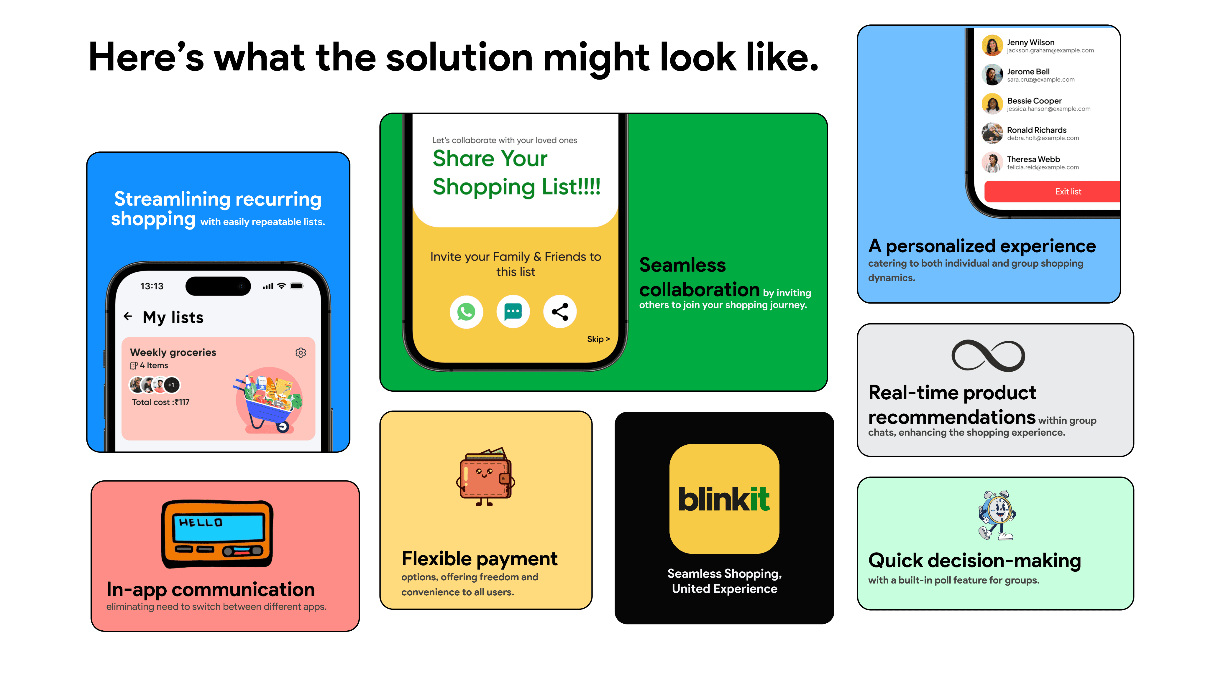
Here’s what the solution might look like.

Streamlining recurring shopping with easily repeatable lists.
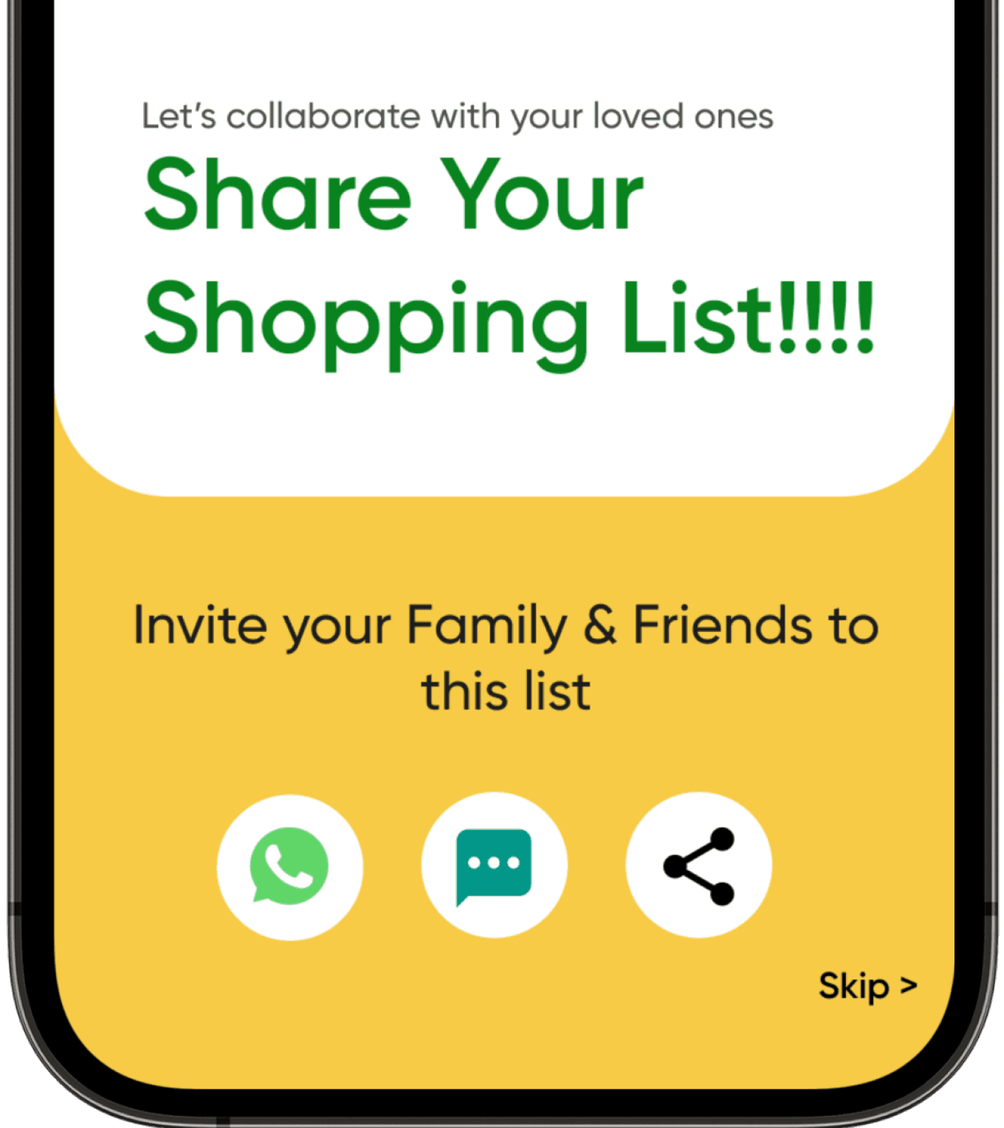
Seamless collaboration by inviting others to join your shopping journey.
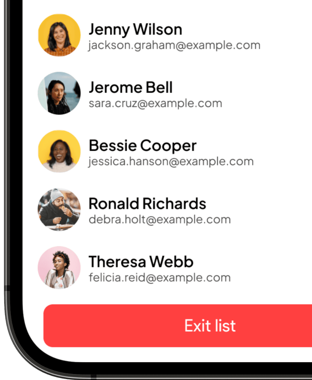
A personalized experience
catering to both individual and group shopping dynamics.
In-app communication eliminating need to switch between different apps.
Quick decision-making with a built-in poll feature for groups.

Real-time product recommendations within group chats, enhancing the shopping experience.

Flexible payment options, offering freedom and convenience to all users.

Seamless Shopping, United Experience


CREATION
The biggest
challenge included
aggregating, sorting, and presenting all the information in a way that is mind-numbingly easy to understand, find, and nice to look at.
And so the
creation began...


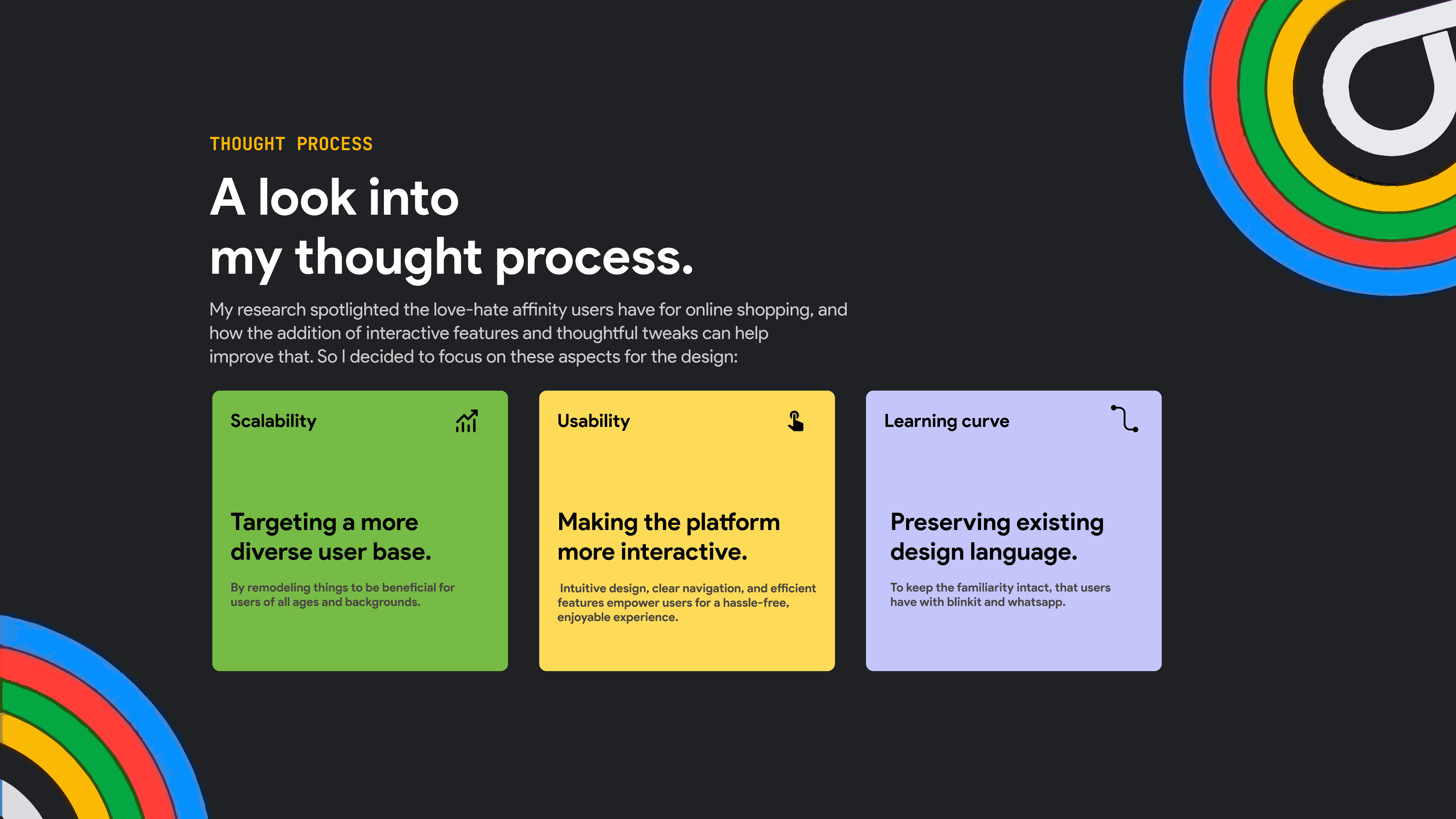
Thought process
A look into
my thought process.
My research spotlighted the love-hate affinity users have for online shopping, and
how the addition of interactive features and thoughtful tweaks can help
improve that. So I decided to focus on these aspects for the design:
Scalability
Targeting a more
diverse user base.
By remodeling things to be beneficial for
users of all ages and backgrounds.
Preserving existing
design language.
To keep the familiarity intact, that users
have with blinkit and whatsapp.
Learning curve
Usability
Making the platform more interactive.
Intuitive design, clear navigation, and efficient features empower users for a hassle-free, enjoyable experience.

I created the solution in mainly three stages.
(with a couple of more intermediary steps)

How I got the
Real stuff done.
I created by looking at usual perspectives with my unusual eyes and galaxy brain thinking to create magic out of chaos all while being inspired by the single greatest thing, the deadline.
CREATION
The biggest
challenge included
aggregating, sorting, and presenting all the information in a way that is mind-numbingly easy to understand, find, and nice to look at.
And so the
creation began...




Stage 1 of 3
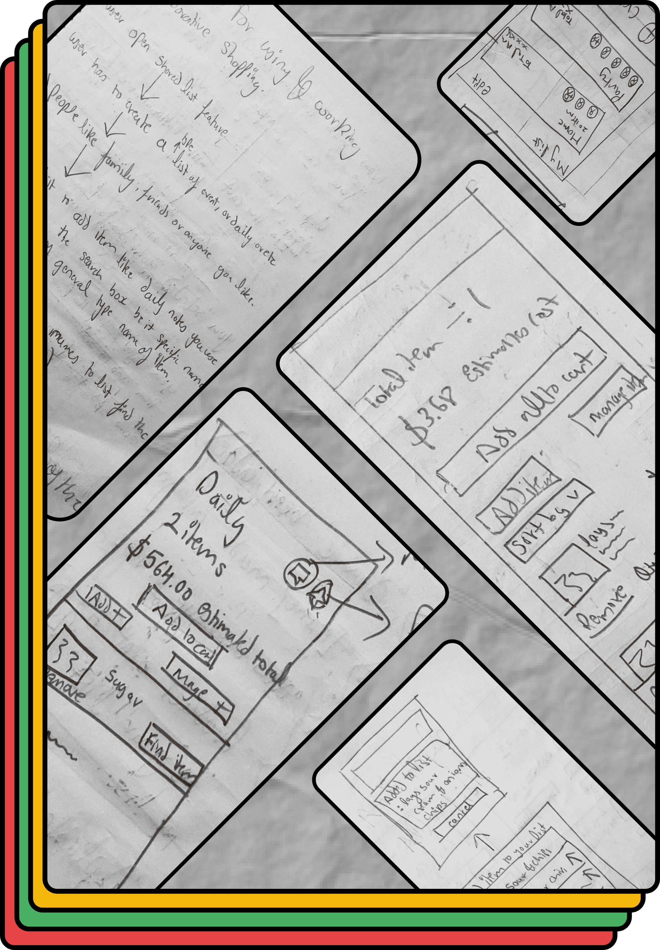
Exploring ways to
approach the solution.
I focused on finalizing the feature to be included in
creating a detailed IA, and sketching out different
design layouts which would be intuitive to use and
scalable.
Stage 2 of 3
Building the visual
identity and user flow.
I picked one design layout and created variations to
get feedback on different user flows. Then finalized
user flow and design elements for the brand identity.









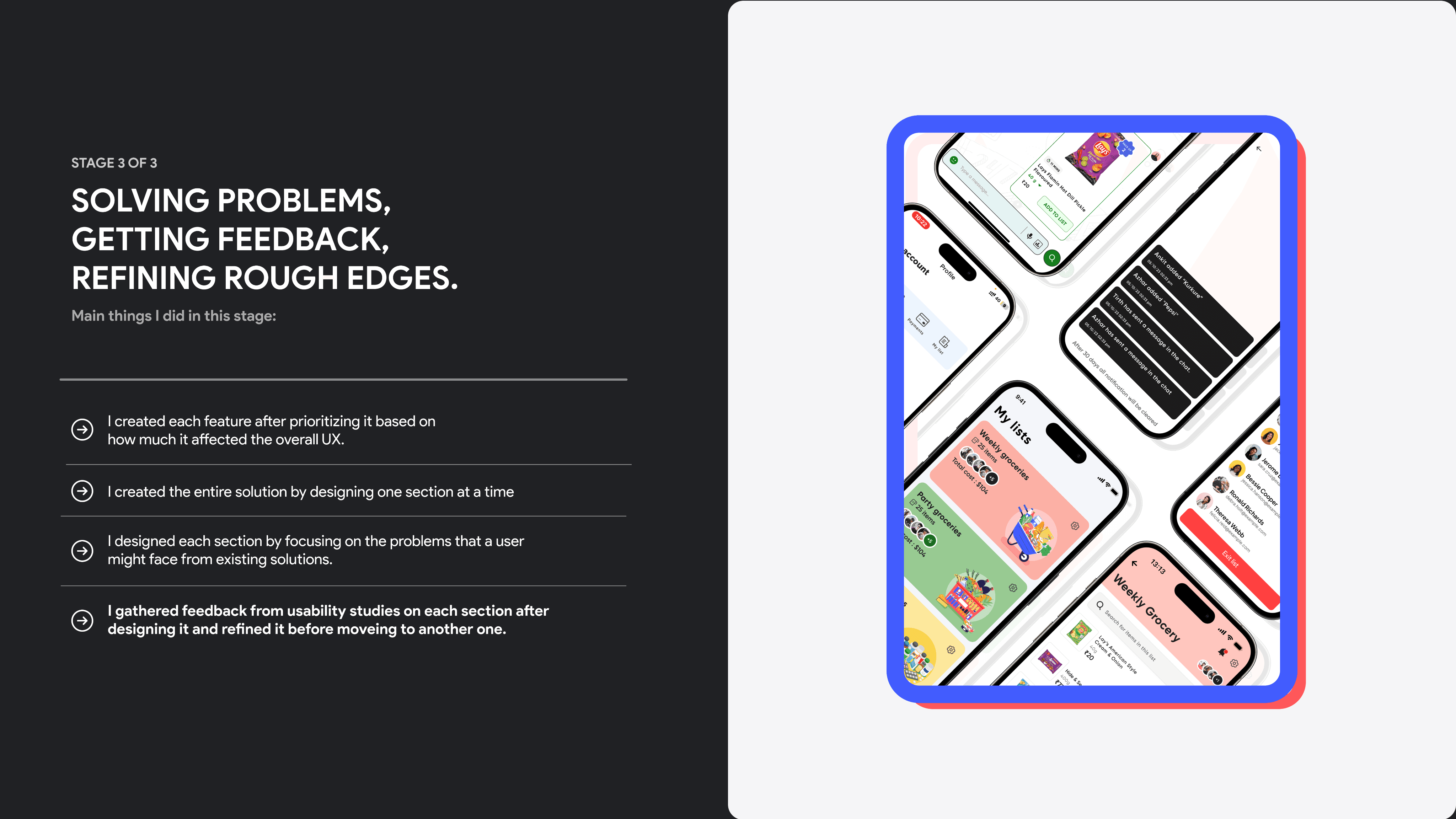
STAGE 3 OF 3
Solving problems, getting feedback, refining rough edges.
Main things I did in this stage:
I created each feature after prioritizing it based on
how much it affected the overall UX.
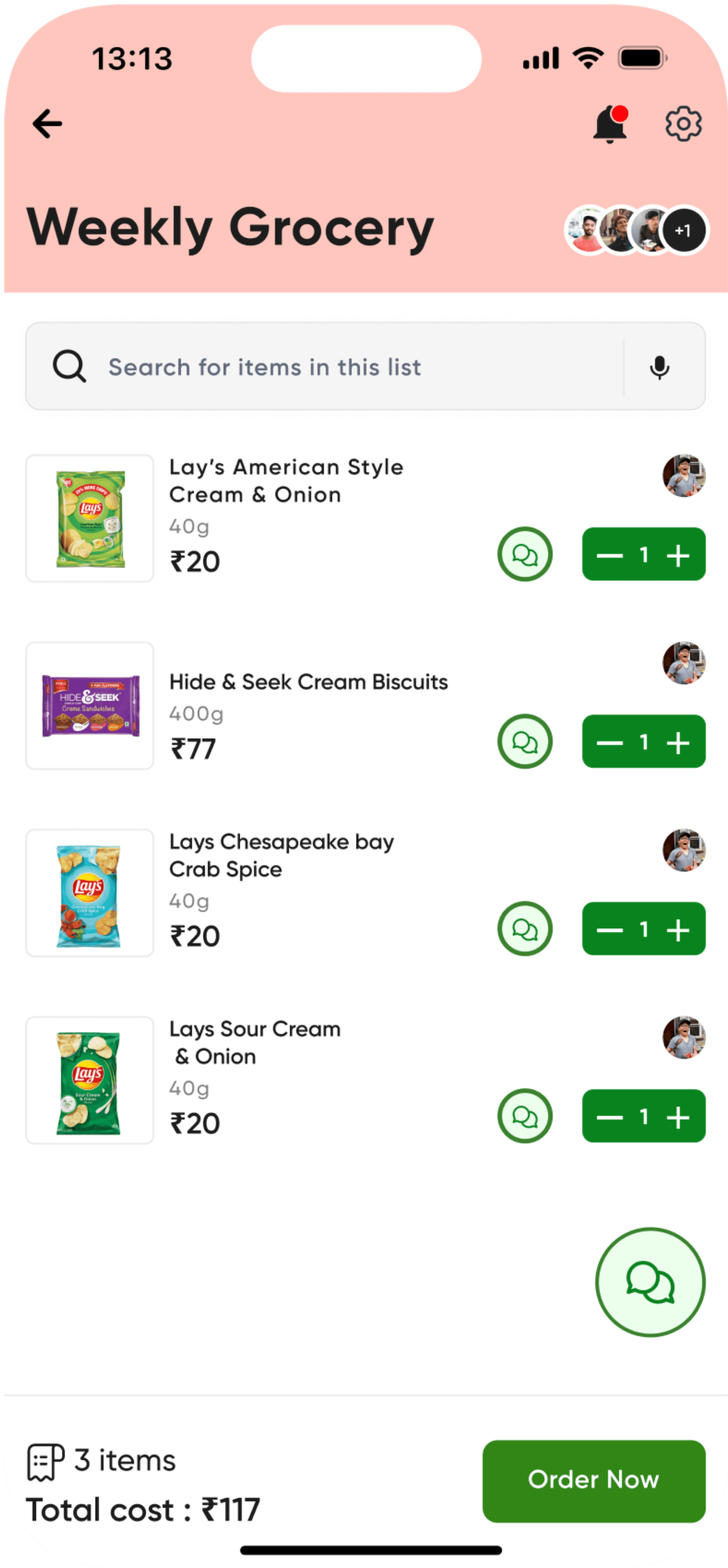
I created the entire solution by designing one section at a time
I designed each section by focusing on the problems that a user might face from existing solutions.
I gathered feedback from usability studies on each section after designing it and refined it before moveing to another one.










Solution Showcase
And finally,
say hello to Blinkit
Together.
Explore how Blinkit Together revolutionizes shopping for users of all preferences, making collaborative shopping effortlessly enjoyable and accessible to everyone.








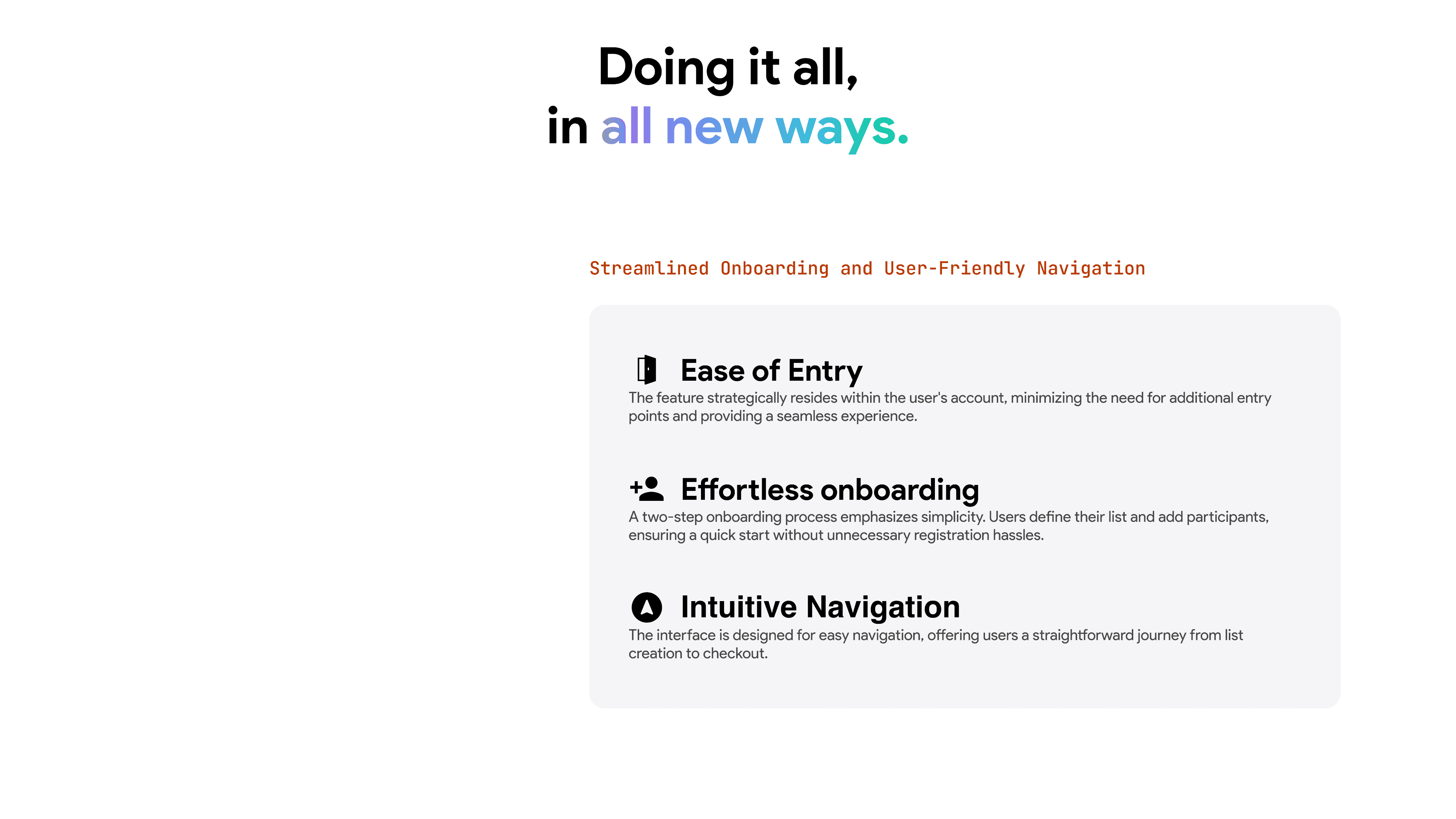
Streamlined Onboarding and User-Friendly Navigation
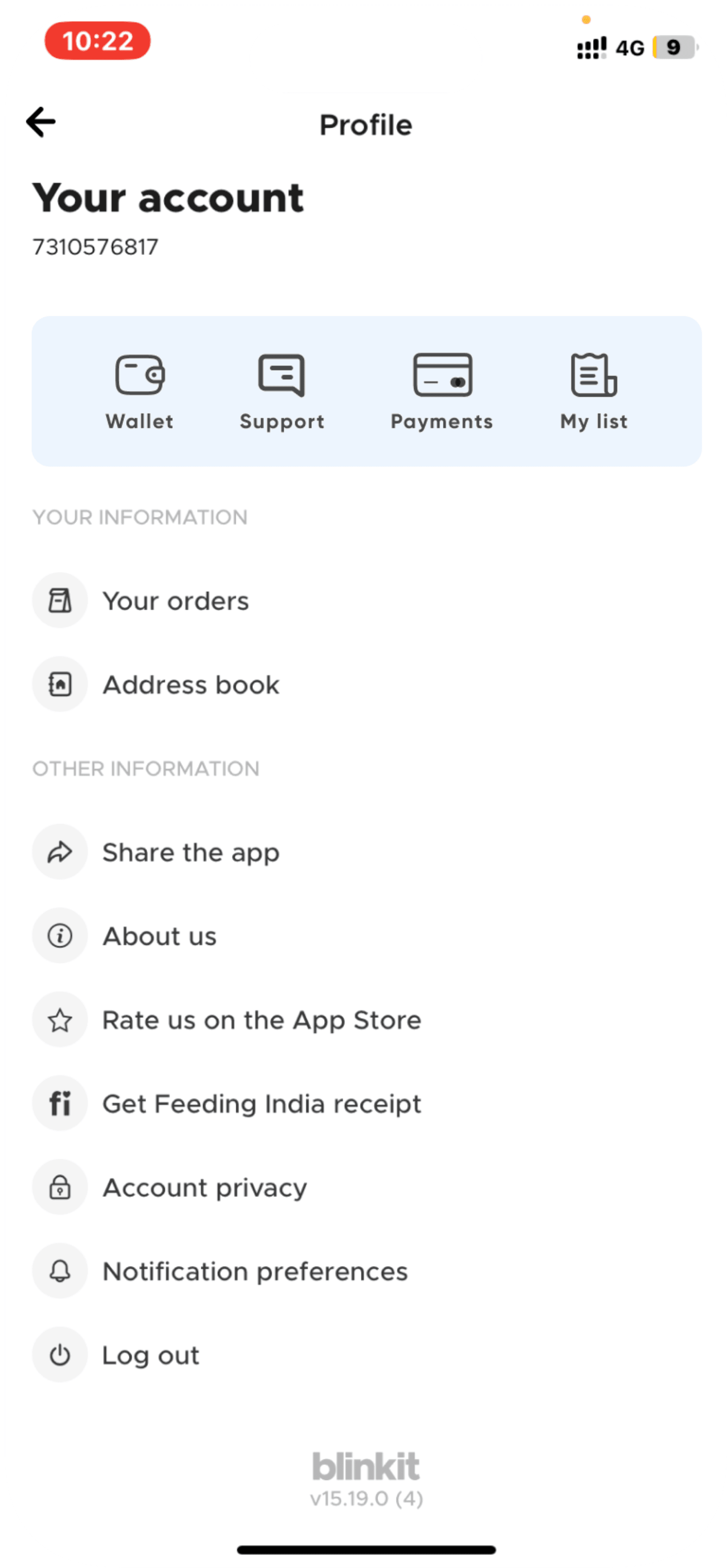
Ease of Entry
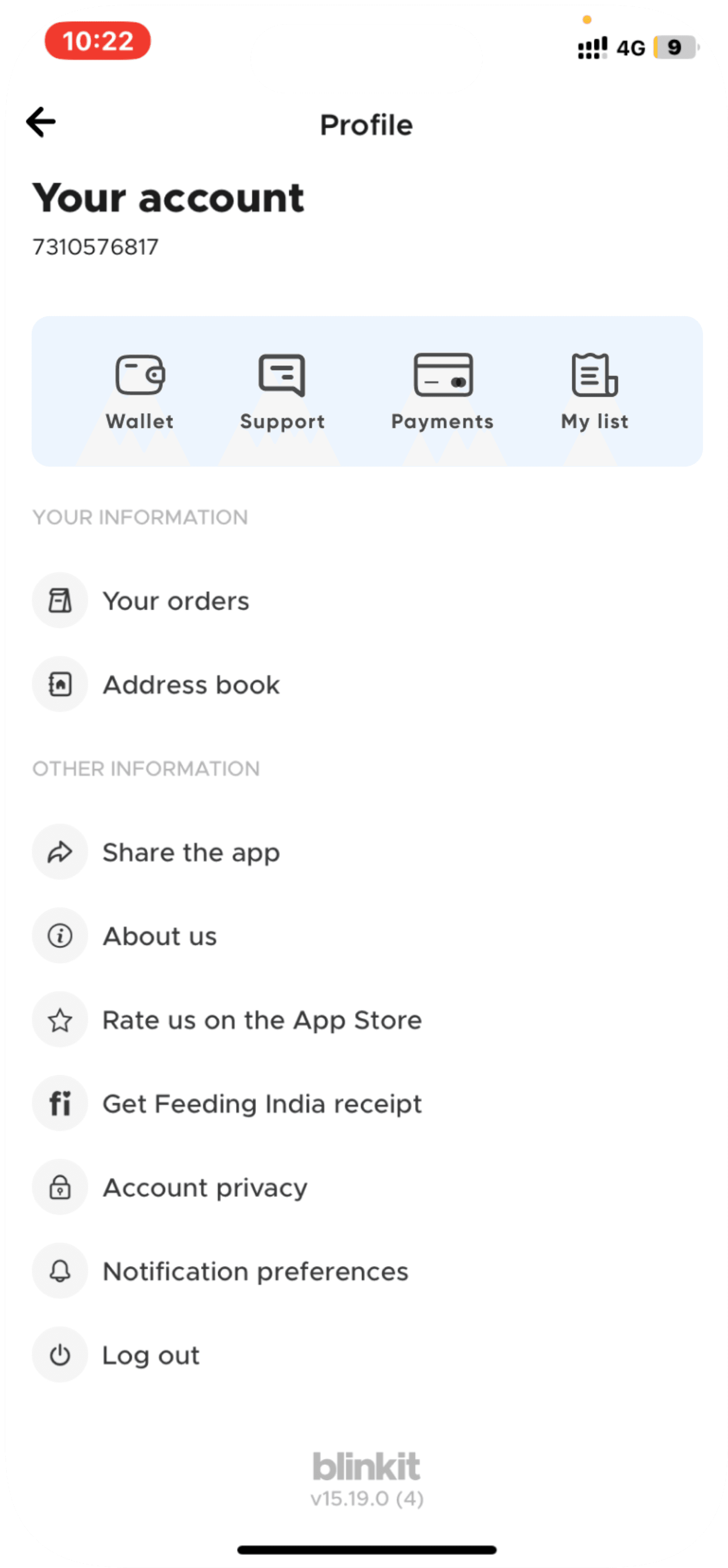
The feature strategically resides within the user's account, minimizing the need for additional entry points and providing a seamless experience.
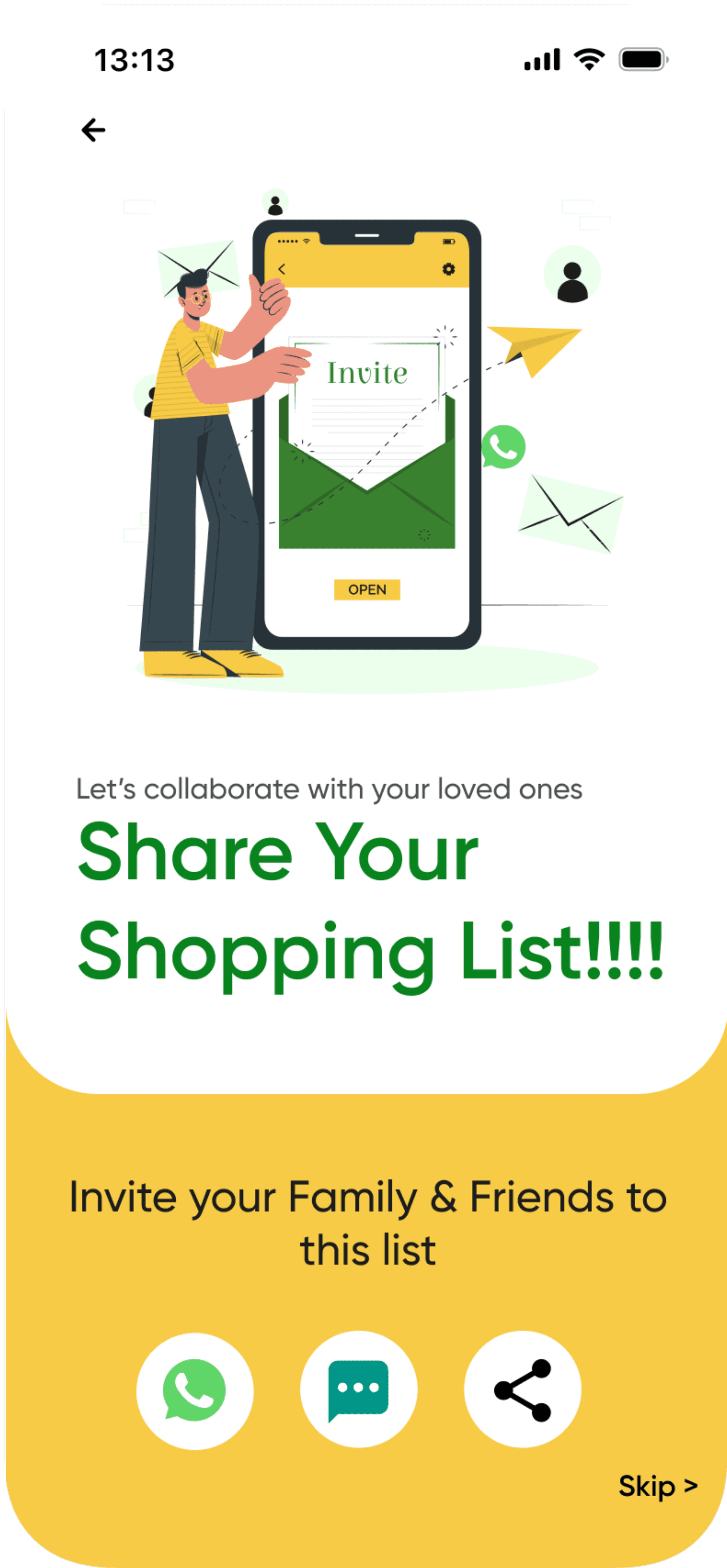
Effortless onboarding
A two-step onboarding process emphasizes simplicity. Users define their list and add participants, ensuring a quick start without unnecessary registration hassles.
Intuitive Navigation
The interface is designed for easy navigation, offering users a straightforward journey from list creation to checkout.
Doing it all,
in all new ways.
powerful.
Personal is
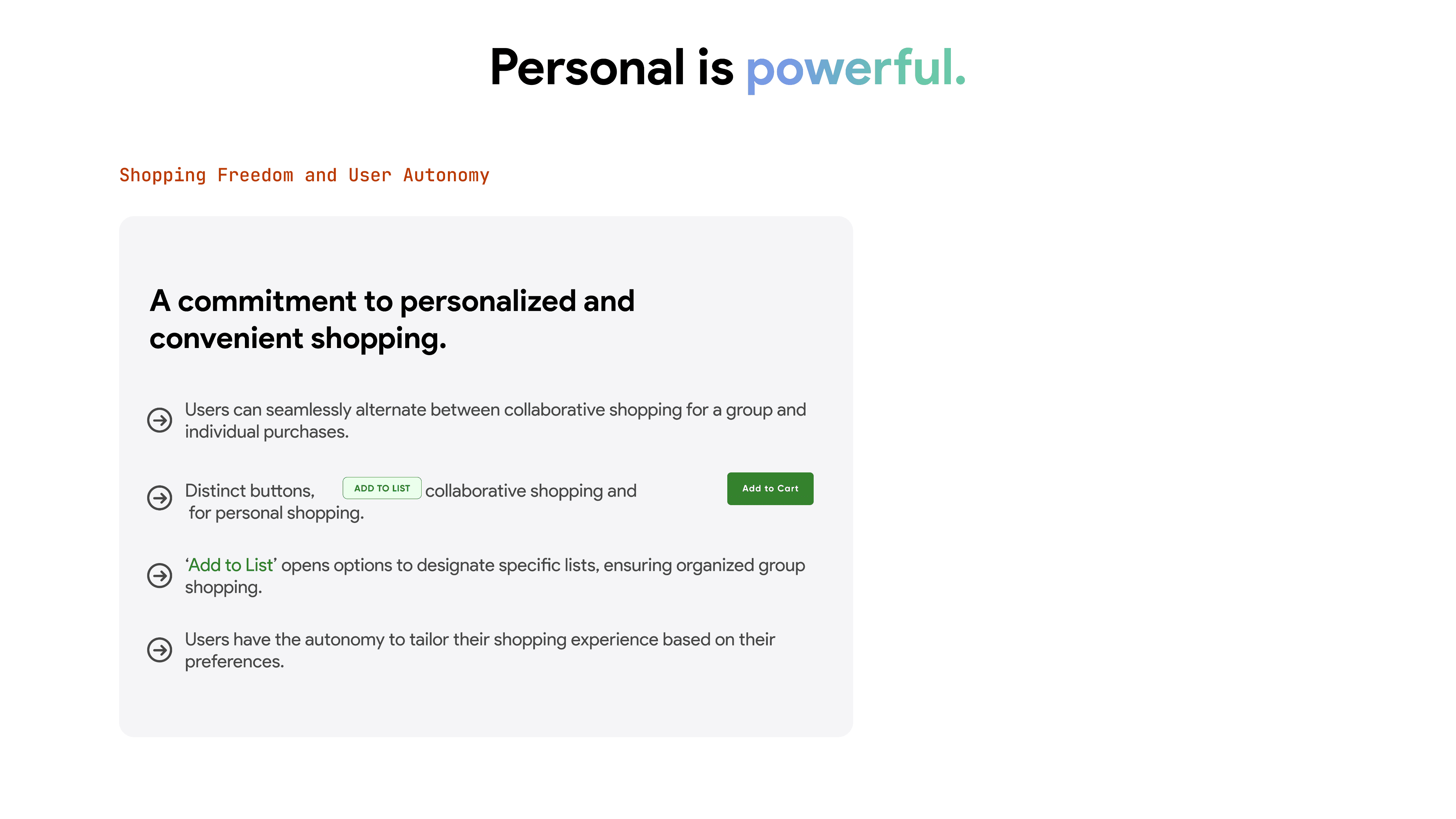
Shopping Freedom and User Autonomy
A commitment to personalized and convenient shopping.
Users can seamlessly alternate between collaborative shopping for a group and individual purchases.
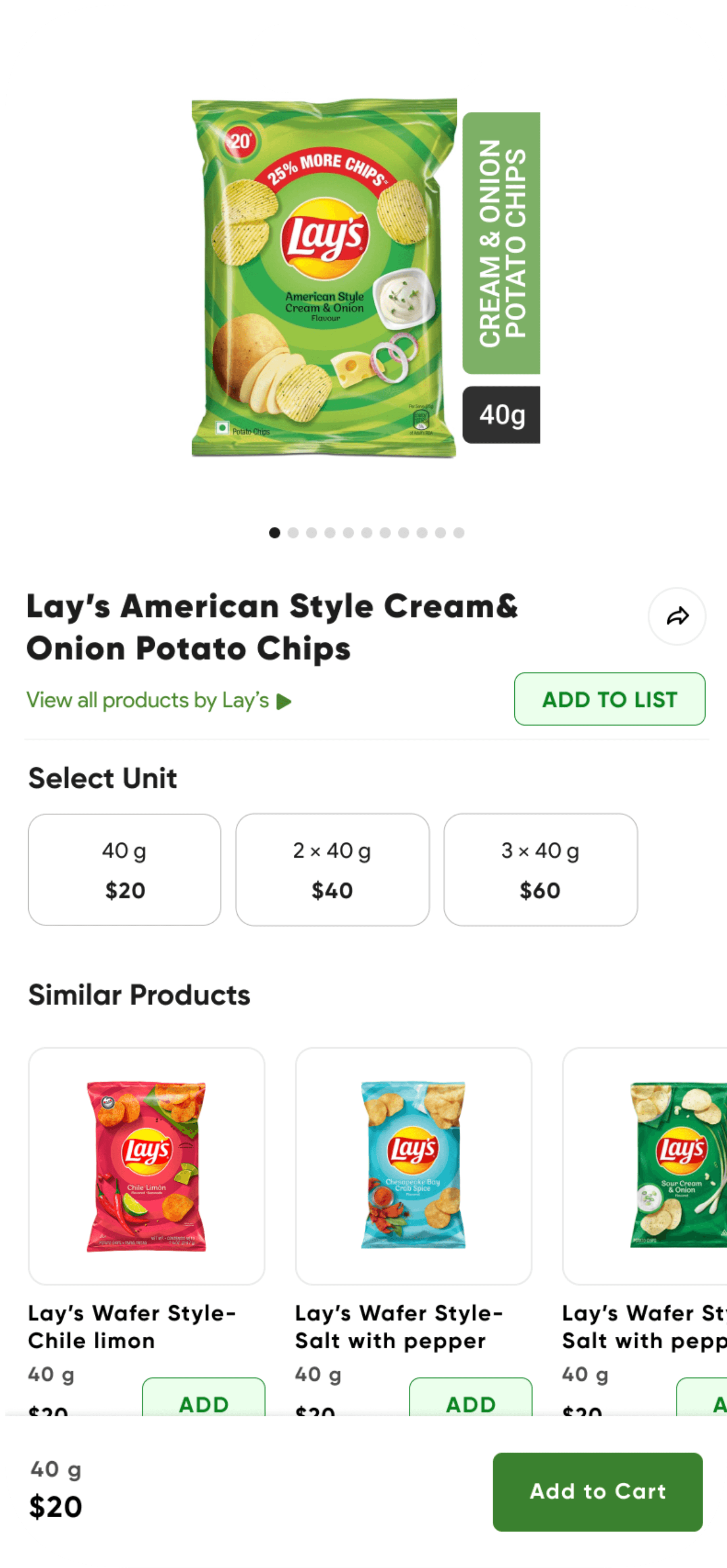
Distinct buttons, for collaborative shopping and
for personal shopping.
Add to List
Add to Cart
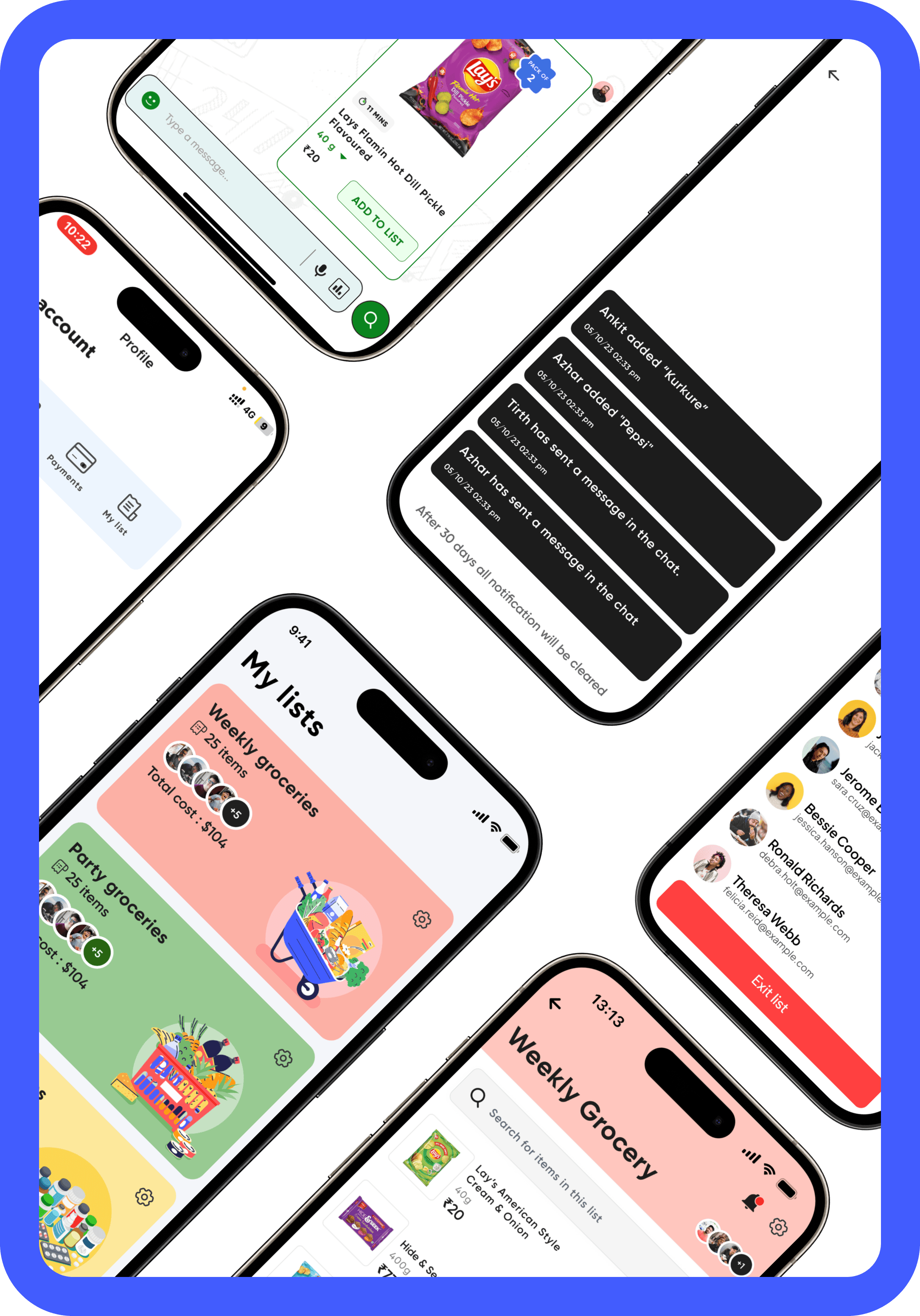
‘Add to List’ opens options to designate specific lists, ensuring organized group shopping.
Users have the autonomy to tailor their shopping experience based on their preferences.
A bold
new experience.
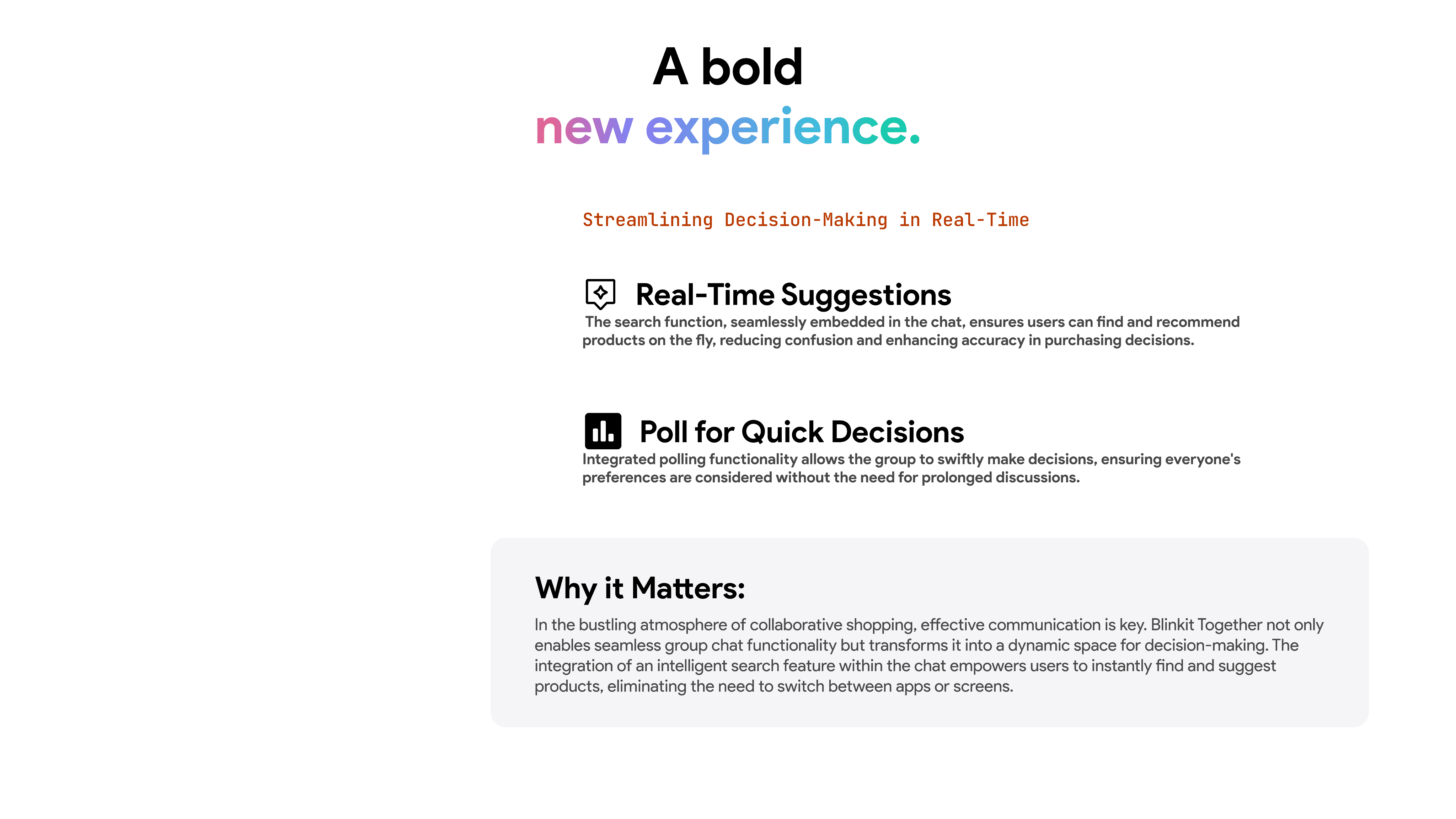
Streamlining Decision-Making in Real-Time
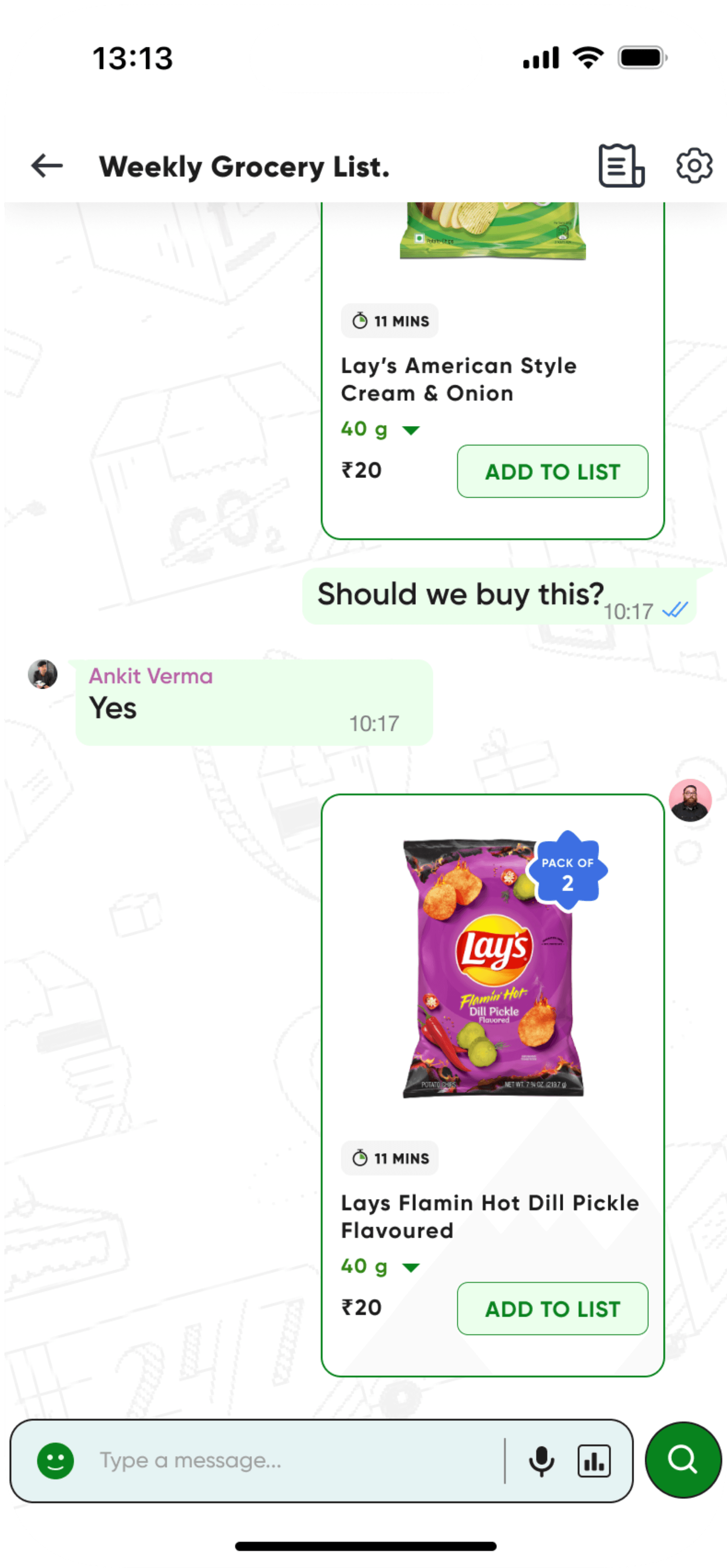
Real-Time Suggestions
The search function, seamlessly embedded in the chat, ensures users can find and recommend products on the fly, reducing confusion and enhancing accuracy in purchasing decisions.
Poll for Quick Decisions
Integrated polling functionality allows the group to swiftly make decisions, ensuring everyone's preferences are considered without the need for prolonged discussions.
Why it Matters:
In the bustling atmosphere of collaborative shopping, effective communication is key. Blinkit Together not only enables seamless group chat functionality but transforms it into a dynamic space for decision-making. The integration of an intelligent search feature within the chat empowers users to instantly find and suggest products, eliminating the need to switch between apps or screens.
A bold
And so much
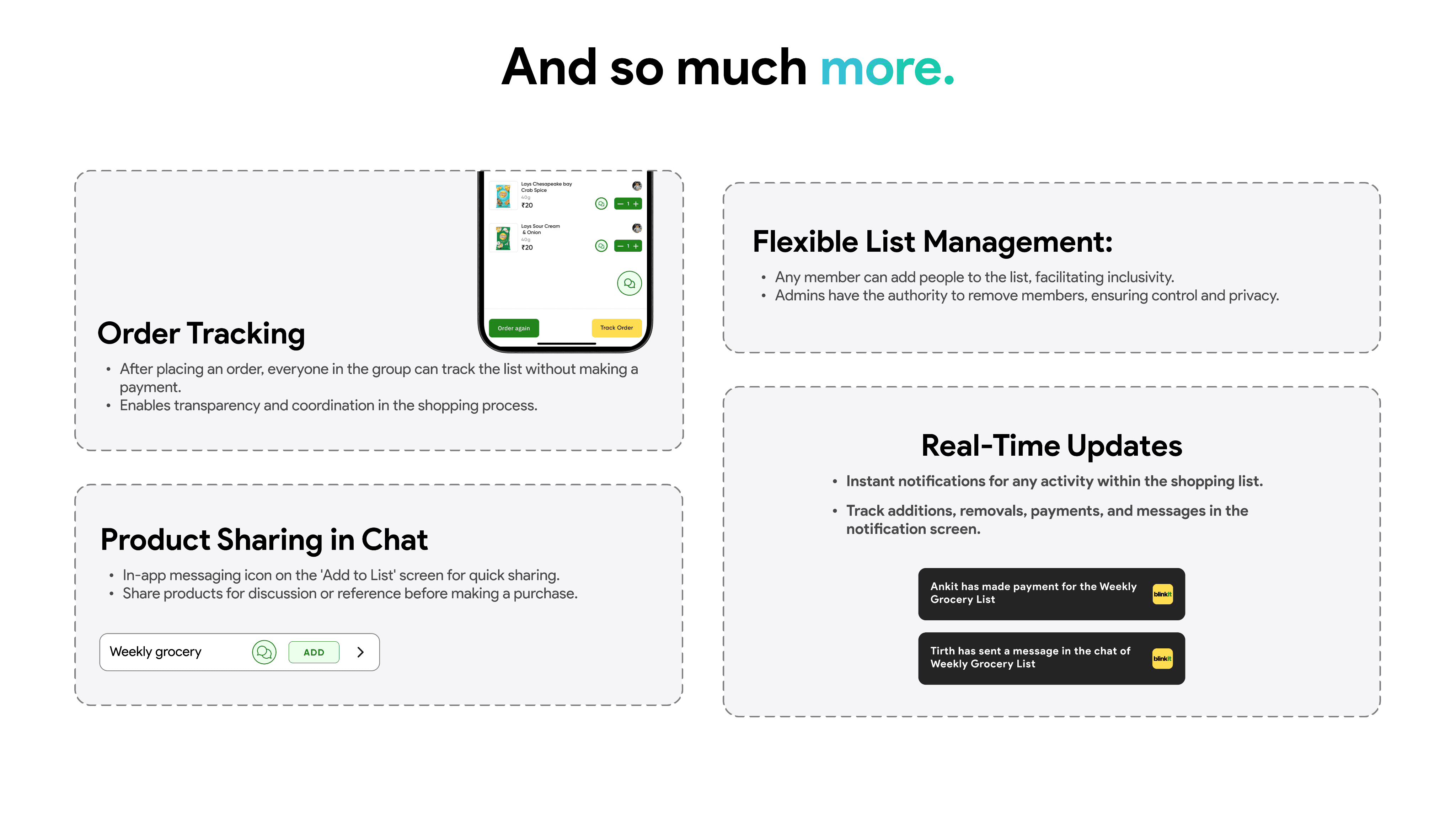
Order Tracking
After placing an order, everyone in the group can track the list without making a payment.
Enables transparency and coordination in the shopping process.


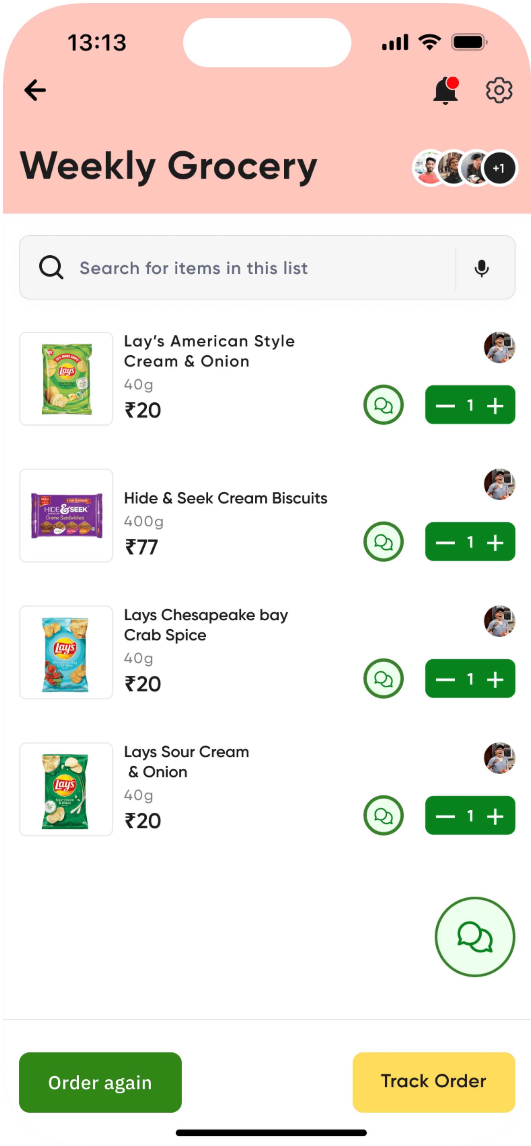
Product Sharing in Chat
In-app messaging icon on the 'Add to List' screen for quick sharing.
Share products for discussion or reference before making a purchase.
Weekly grocery
ADD
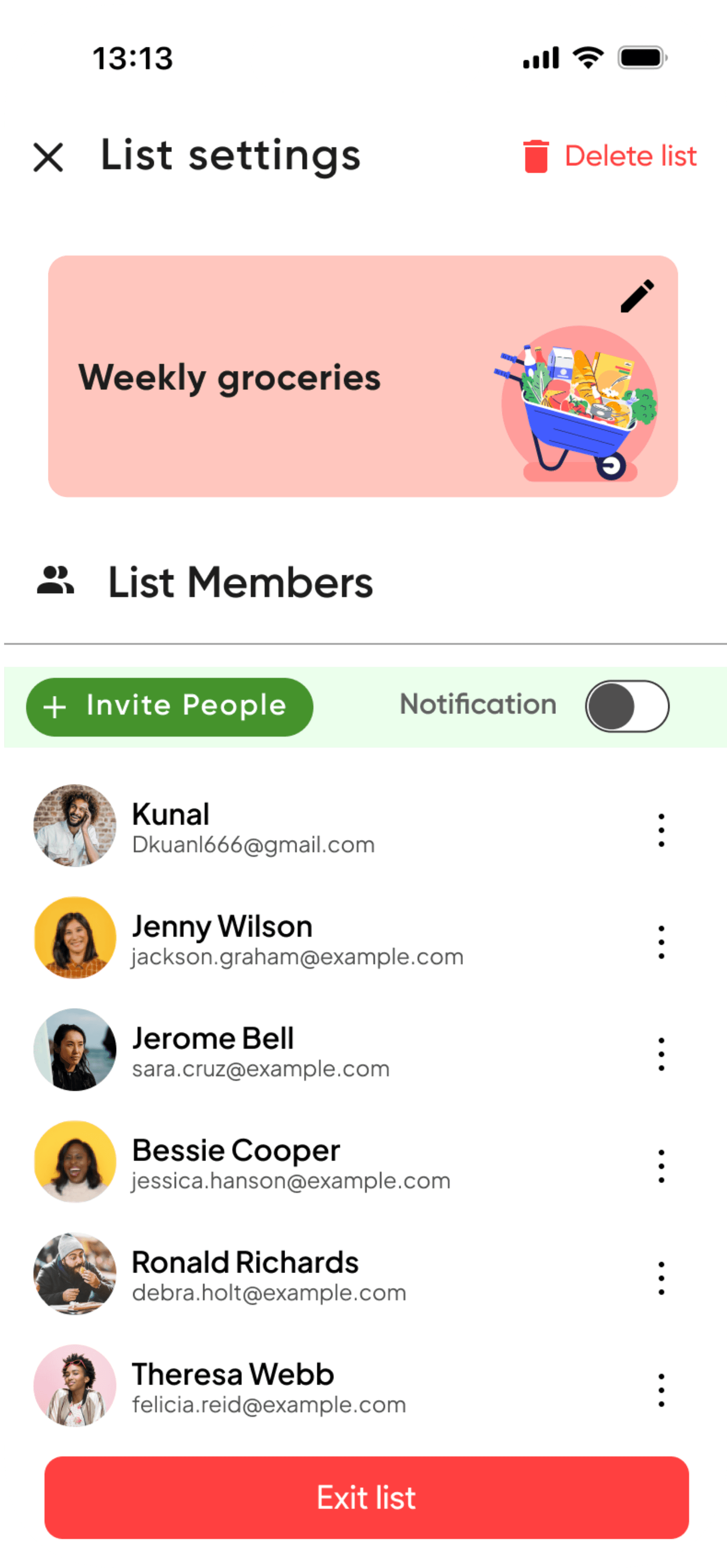
Flexible List Management:
Any member can add people to the list, facilitating inclusivity.
Admins have the authority to remove members, ensuring control and privacy.
more.
View Prototype
Real-Time Updates
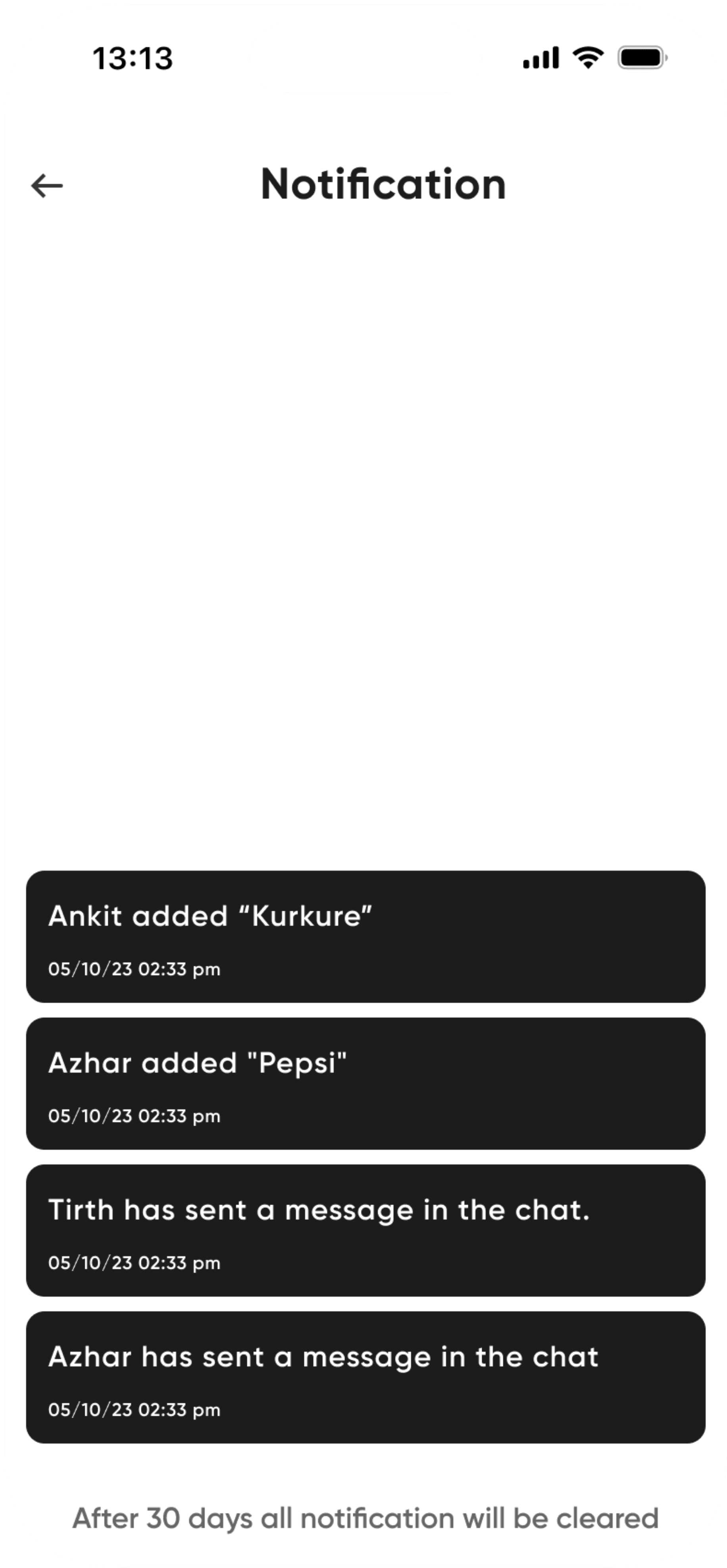
Instant notifications for any activity within the shopping list.
Track additions, removals, payments, and messages in the notification screen.
Ankit has made payment for the Weekly Grocery List

Tirth has sent a message in the chat of Weekly Grocery List

Takeaways
So, what
did I learn?
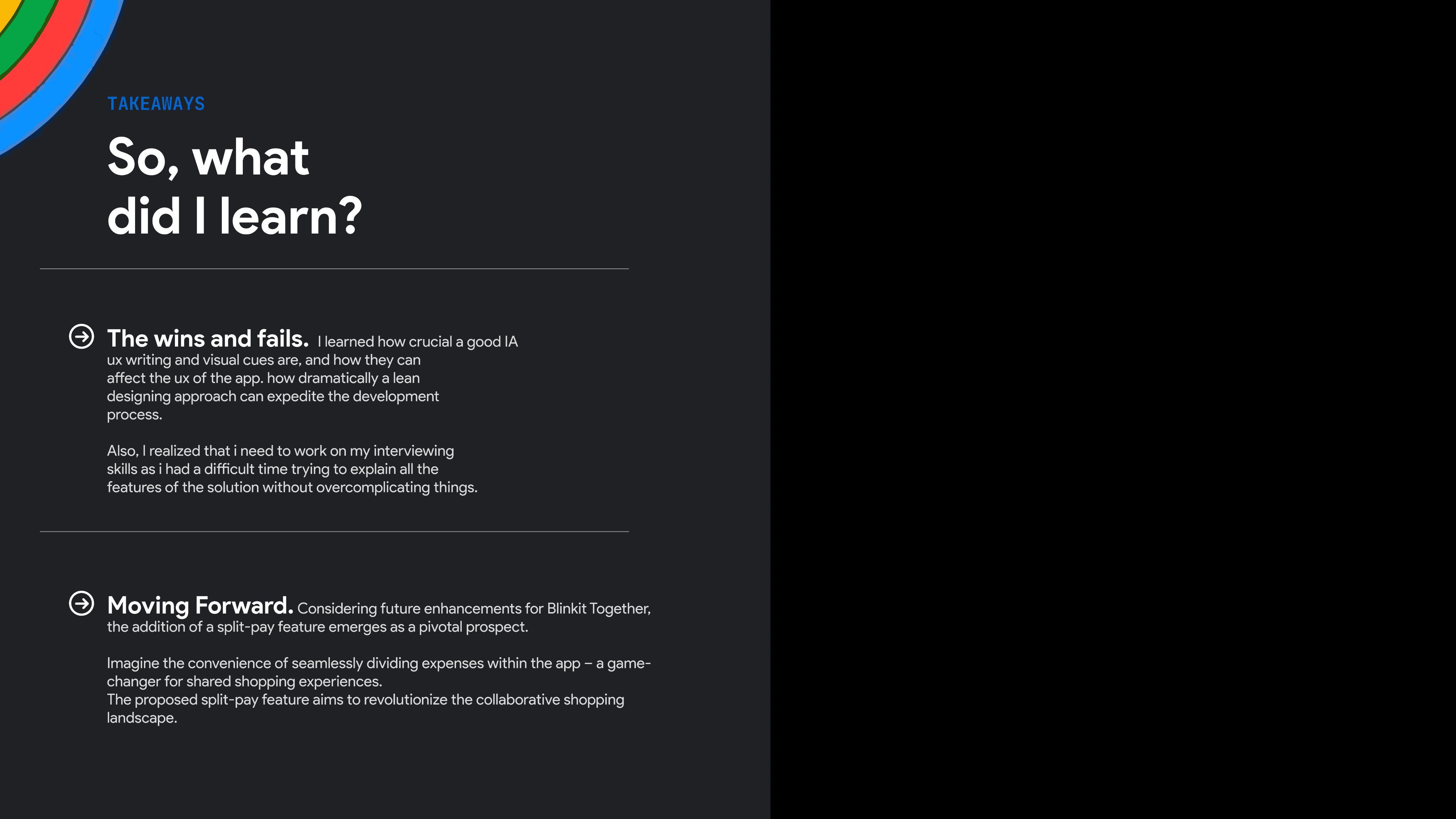
The wins and fails. I learned how crucial a good IA
ux writing and visual cues are, and how they can
affect the ux of the app. how dramatically a lean
designing approach can expedite the development
process.
Also, I realized that i need to work on my interviewing
skills as i had a difficult time trying to explain all the
features of the solution without overcomplicating things.
Moving Forward. Considering future enhancements for Blinkit Together, the addition of a split-pay feature emerges as a pivotal prospect.
Imagine the convenience of seamlessly dividing expenses within the app – a game-changer for shared shopping experiences.
The proposed split-pay feature aims to revolutionize the collaborative shopping landscape.


And that’s all from my side
Thanks for checking this out.





And then the
exploration began...




CREATION
The biggest
challenge included
aggregating, sorting, and presenting all the information in a way that is mind-numbingly easy to understand, find, and nice to look at.
And so the
creation began...


Thought process
A look into
my thought process.
My research spotlighted the love-hate affinity users have for online shopping, and
how the addition of interactive features and thoughtful tweaks can help
improve that. So I decided to focus on these aspects for the design:


Usability
Making the platform more interactive.
Intuitive design, clear navigation, and efficient features empower users for a hassle-free, enjoyable experience.
Scalability
By remodelling things to be beneficial for users of all ages and backgrounds.
Targeting a more
diverse user base.
Learning curve
Preserving existing
design language.
To keep the familiarity intact, that users
have with blinkit and whatsapp.


Stage 2 of 3
Building the visual
identity and user flow.
I picked one design layout and created variations to
get feedback on different user flows. Then finalized
user flow and design elements for the brand identity.
STAGE 1 of 2
Exploring ways to approach the solution
I focused on finalizing the feature to be included in creating a detailed IA, and sketching out different design layout which would be inutive to use and scalable







And that’s all from my side
Thanks for checking this out.


